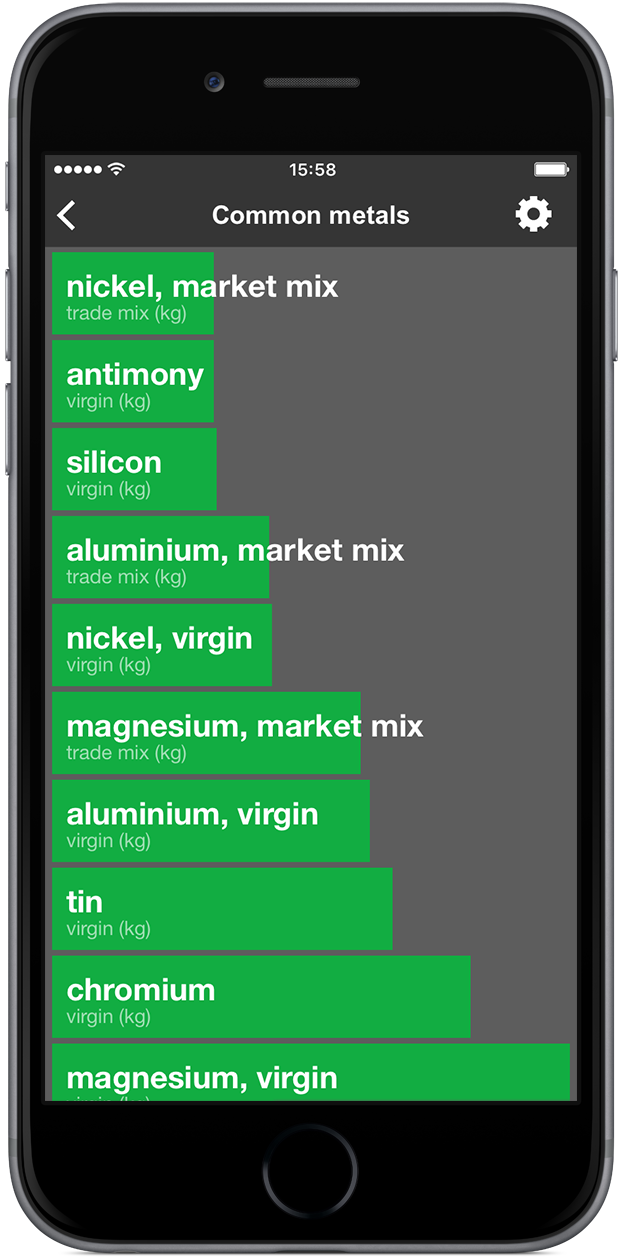
Visual rankings
Entries within a category are visually represented as bars, sorted by score or alphabet whichever personal preference dictates. Scores directly correspond to bar size, a larger bar indicating a larger environmental impact as compared to a smaller bar indicating a less significant impact.
The bar’s primary color relates to the chosen indicator, whereas its shade communicates the chosen end-of-life scenario. The end-of-life contribution on the score (if applicable) is visualized as shown in the animation below.